You can trust VideoGamer. Our team of gaming experts spend hours testing and reviewing the latest games, to ensure you're reading the most comprehensive guide possible. Rest assured, all imagery and advice is unique and original. Check out how we test and review games here
Each Month, we invite élite art critic Braithwaite Merriweather to appraise the box art of the latest game releases. In between his time spent wandering the corridors of culture, Merriweather writes on a freelance basis for various publications, including Snitters and Beau Afriqué. If you are unaware of his prowess, rest assured; he’s on a crusade to educate the unwashed. Put simply, he’s a man that needs no introduction.
Assassin’s Creed Odyssey
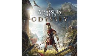
One way to confront cliché is not to slink under its grasp, like a demure and frumpy feline, but rather to besiege it, and with Assassin’s Creed Odyssey, Ubisoft has unleashed hell. Battles, boats, and bursts of colour: the entirety of rollicking Ancient Greek entertainment has been belted round the waist and forced into frame. The image is filtered through the blues of Greek life: the skies, the seas, and the shields in an orgiastic wave that reminds me of idle summers and my walking the length of the Kent canal.
The cliché that’s found itself the recipient of this full-throttle thrashing is that of the Rückenfigur (‘figure seen from behind,’ in German), the grey-bearded grandfather of a thousand game cases – most breathless of which is Caspar David Friedrich’s The Wanderer Above the Sea of Fog. Behold its bastard children: Breath of the Wild, Bloodborne, and Doom. They all present the lone figure staring down or turning away from a vista of some sort. But we must dig deeper; we must peel away the top coat and delve into the treasures of history.
Between the parthenons and the poseidons, it’s clear that Ubisoft has been inspired by the classic Minoan flotilla frescoes. It’s in the squared frivolity of these scenes that we find the joie de vivre of Greek life! The odyssey of commerce, war, love, the billowing of togas, and thus, do we arrive at the sheer essence of what Ubisoft has achieved. Art imitates art that imitates life – thus, the eternal dance continues…
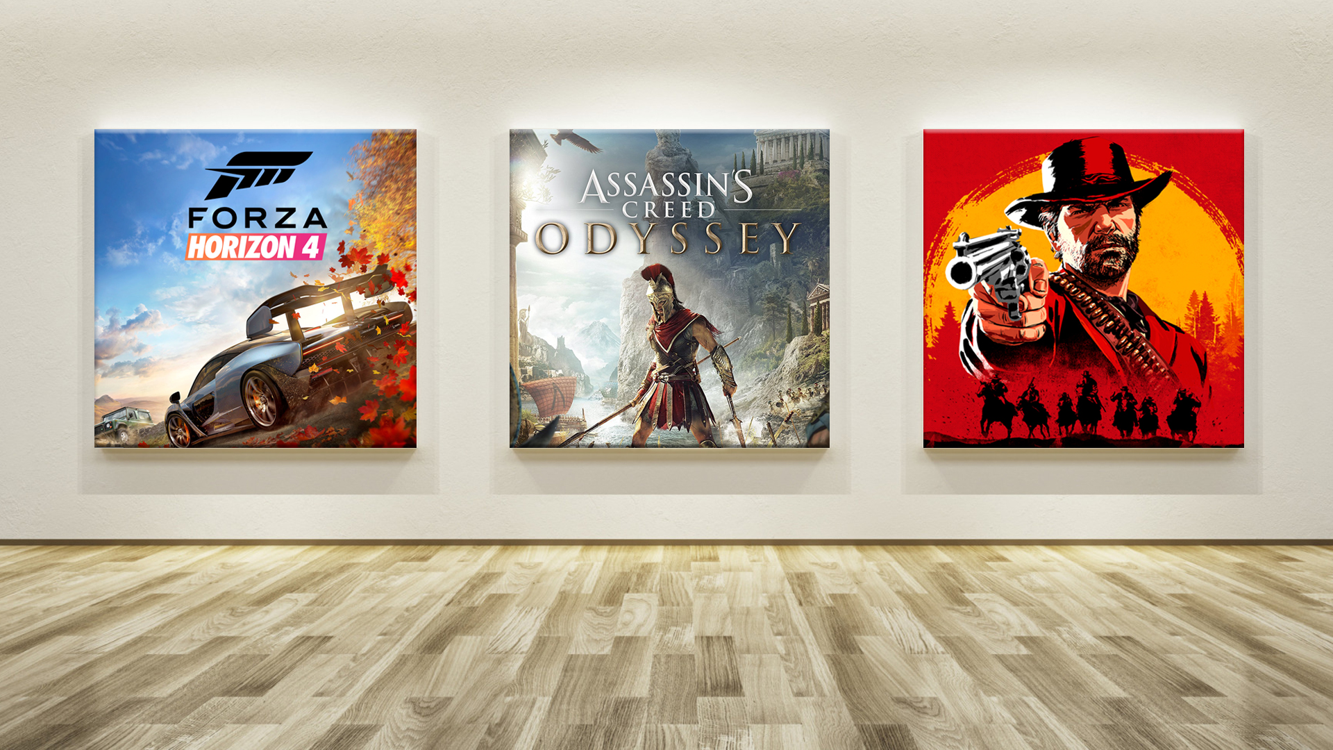
Forza Horizon 4
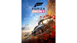
Poetry in motion they may be, but in painting, cars tend to spin their wheels. With Twelve Cars (1962), Warhol – ever the puckish trickster – would have you believe he was making a statement about commercialised art and the miracle of mass production. How very convenient; there’s nothing like taking a stand to powder over artistic inertia. Personally, I think it’s a rusty ruse; in failing to conjure a sense of movement, he surely deferred to duplication, settling on cloning the Cadillac and folding his arms like a defeated scullery maid – the bastard.
Overcoming defeat by utterly succumbing to it, Vettriano, in Bluebird at Bonneville, decides to stay parked. Setting the shark-sleek machine on the papery salt flats and pinning it down with a gaggle of press, Vettriano changes gears (you are to forgive me immediately) and focusses not only on the still beauty of the automobile, but the devastating nature of the surrounds. It’s this that Playground Games has been inspired by, shifting the emphasis from speed to ornament.
The cars in question, a McLaren Senna and a Jeep Wrangler, are tarted up with the usual action pose embellishment – the wheels brushed with blur and the explosive shower of stone. But it’s the game’s other vehicle that redeems the trundling cover: the seasons. Each is a vehicle for the kind of colour that instills a sense of something you once knew absolutely but have long since forgotten. The bluster of copper in the corner crashes, like a wave, against spring skies and alpine sun, while pregnant clouds cluster in the distance like a brood of expectant mothers.
Red Dead Redemption
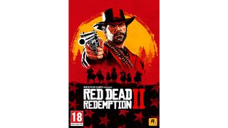
How’s this for saturated saturnalia. Rockstar’s choice of box art belongs to a lineage of lurid spaghetti western posters, sparked with the likes of Django and A Fistful of Dollars. The whole thing looks as if it’s been mopped with a basecoat of blood. Puddles of black gather in the flag underneath, the horses below, and brim of the hat above. The only relief comes by way of the gun and the sun – the former a cooling sliver of grey, the latter a spongy swash of yellow. Glimpsing the poster after stumbling woozily out of the Tate Britain, I had to sit and regain my faculty.
But if, gazing at the poster to Red Dead Redemption 2 for an extended period of time – and I would strongly recommend doing so, preferably with a glass of Châteauneuf Du Pape – you feel a sense of rapture, then don’t worry. It isn’t the wine; it isn’t Rockstar; it’s Rothko. Where else but the sear of Orange and Yellow (1956) has the developer gazed for enrichment? On his use of colour, Rothko said they were to express ‘tragedy, ecstasy, doom,’ adding, ‘The people who weep before my pictures are having the same religious experience I had when I painted them.’
Well there you go, then; if you’re not weeping come October 26, when holding the thing in your greasy hands, I want to know why. I myself will be absent – an extended dalliance at the Colnaghi is calling me away – but that’s no matter; as soon as these discs are liberated from their sumptuous shells, I care no longer. The treasure was always the chest… adieu!
About the Author


