You can trust VideoGamer. Our team of gaming experts spend hours testing and reviewing the latest games, to ensure you're reading the most comprehensive guide possible. Rest assured, all imagery and advice is unique and original. Check out how we test and review games here
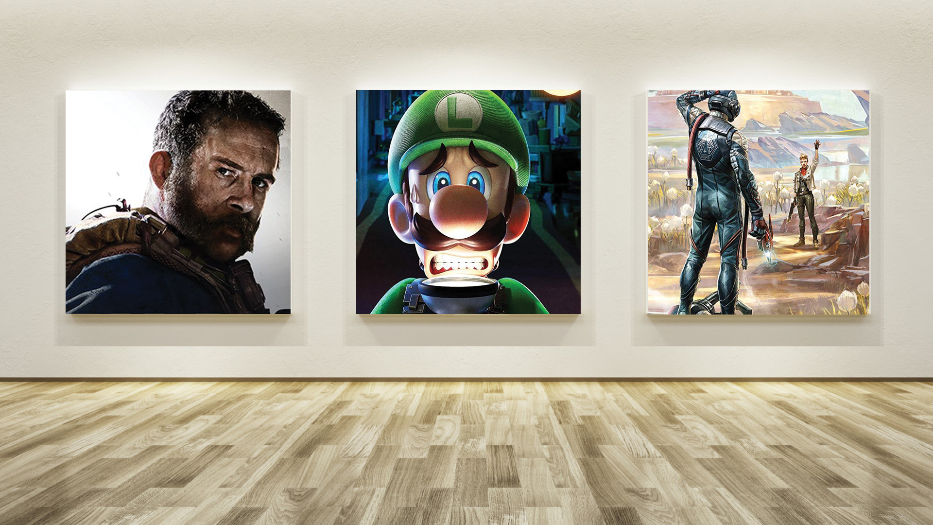
Each month, we invite élite art critic Braithwaite Merriweather to appraise the box art of the latest game releases. In between his time spent wandering the corridors of culture, Merriweather writes on a freelance basis for various publications, including Snitters and Nuneaton à la Carte. If you are unaware of his prowess, rest assured; he’s on a crusade to educate the unwashed. Put simply, he’s a man that needs no introduction.
This month’s bundle of box art has reached me as I lounge in the Courtauld. It is supposed to be a self-governing college of the University of London, but I assure you there is nothing self-governing about it. I had to barge my way past a slouching gaggle of camera-wielding tourists as I made my way through the front courtyard. Then, once inside, one of the neanderthals in security asked me if I had a valid pass. Absolute fool. I informed them that I once gave a lecture at the Courtauld – an impromptu one, to a huddled crowd, before the same philistines in security came to ‘break it up’ – as though an art education, like a protest, is something that can be ‘broken up’.
In any case, security didn’t seem to want to argue with me this time, and threw their hands up, allowing me access to the gallery. Ten minutes in, however, and I find myself growing tired of A Bar at the Folies-Bergère and hungry for some game box art. I now sit cross-legged on the cold wood of the gallery floor, with this month’s samples spread about me. To my surprise and delight, there has been a steady trickle of passersby who have presumed that I am putting on a show of sorts. I have answered their questions; or, at least, I have chosen the questions that have least offended me and answered those. I may consider giving another lecture today, and perhaps making it an ongoing series – it depends if this month’s crop offers sufficient inspiration.
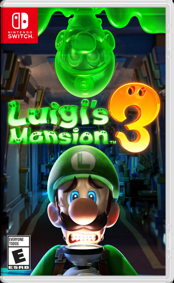
Luigi’s Mansion 3
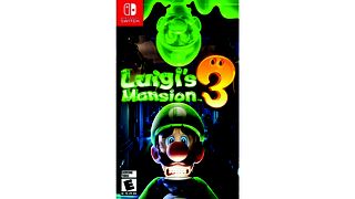
If you ever wondered what The Scream, by Edvard Munch, would look like if it were recast by a computer, stripped of its surreal fever, and included a clone of its subject made from green goo, then look no further than the box art for Luigi’s Mansion 3. Whilst I would enjoy, with no greater relish, being able to inform you that this work seduced my senses with its reverence for Norweigian Expressionism, alas – I cannot. Instead, what I find here is the bastardisation of history. And, to my own personally insulted sensibilities, I also notice a familiar face: this figure on the front is one half of that pair of reprehensible plumbers that I saw and dismissed back in June. I imagine he thinks he can fool me by changing colours from yellow (which he wore then) to green.
A similar trick was played on me by the actual plumber that visited me back then – changing the colour of the various bits of boring tubing in my boiler cupboard and informing me that it was a ‘proper biggun’ of a job. What grotesque individuals these plumbers are. The gloopy morass lurking at the top of the frame of this ‘Luigi’s Mansion 3’ would likely provide as effective a service as a flesh and blood plumber, and would likely cause less mess. No, there's nothing here – the faintest suggestion of Edvard Munch isn’t enough to coax me into a state of acceptance. And anyway, why is tradesman wielding a torch, and why has he found himself, through some cosmic joke, the owner of a mansion – nay, of three mansions? This work is utterly bereft of life and spirit.
Call of Duty: Modern Warfare
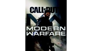
This image is the single most boring image that I have ever looked at in my life. I don’t review stills from advertisements for the armed forces; I’m sending this sample back to my venerable hosts on the grounds that they have accidentally sent me an advert. Whilst I’m here, though, I must note the irony of the title ‘Modern Warfare’ above a man sporting the sort of facial hair last glimpsed at the Battle of the Somme.
The Outer Worlds
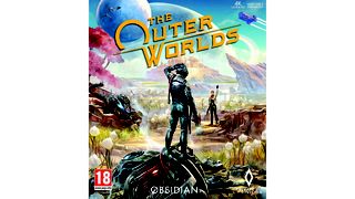
This must be a first. This work, entitled ‘The Outer Worlds’, isn’t outer in the slightest; it spirits me backwards in time to the sharp shoulders of the 1980s. But it doesn't whisk me back to the wider art world; instead, it takes me to the work of Roger Dean, whose ‘art’, if indeed it can be deemed as such (it absolutely cannot), used to hold court in the mildewed basements of prog-rock bores. But it is Dean’s dalliances in the world of early video game box art that this piece puts me in mind of – in particular, of The Black Onyx, which came out in 1984. I got into an awful bust-up with a friend of mine, a prominent Amiga art critic at the time, who was convinced of Dean’s genius. (I heard some really awful things about that friend only recently – I’m sure they’re not true, though.)
Despite my queasiness at the rapacious appetite for colour on show – as if with every stroke the artist grew more impatient with the palette – I find myself amused that the medium has fed on its own past in such a breezy and bizarre manner. This isn’t the sort of box art that teases and tickles the curiosity – I don’t find myself wondering, for instance, what the game might be about, just as I never wondered what Tales from Topographic Oceans, by Yes, was going to be about. It was always going to be about the same nonsense noise. You may pause to wonder what this crashed cosmonaut is up to, but I urge you instead to offer a vaguely amused chuckle, just as the artist did, and simply concern yourself with playing the thing. Or, as Yes put it, ‘To feast on the treasure set for our strange device.’
About the Author