You can trust VideoGamer. Our team of gaming experts spend hours testing and reviewing the latest games, to ensure you're reading the most comprehensive guide possible. Rest assured, all imagery and advice is unique and original. Check out how we test and review games here
Each Month, we invite élite art critic Braithwaite Merriweather to appraise the box art of the latest game releases. In between his time spent wandering the corridors of culture, Merriweather writes on a freelance basis for various publications, including Snitters and Nuneaton à la Carte. If you are unaware of his prowess, rest assured; he’s on a crusade to educate the unwashed. Put simply, he’s a man that needs no introduction.
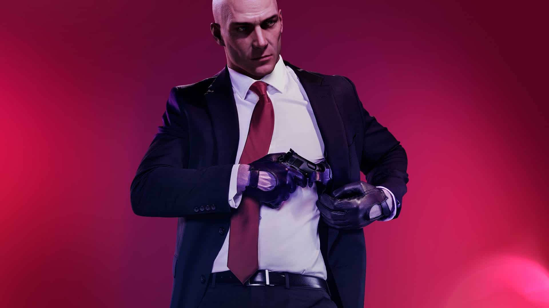
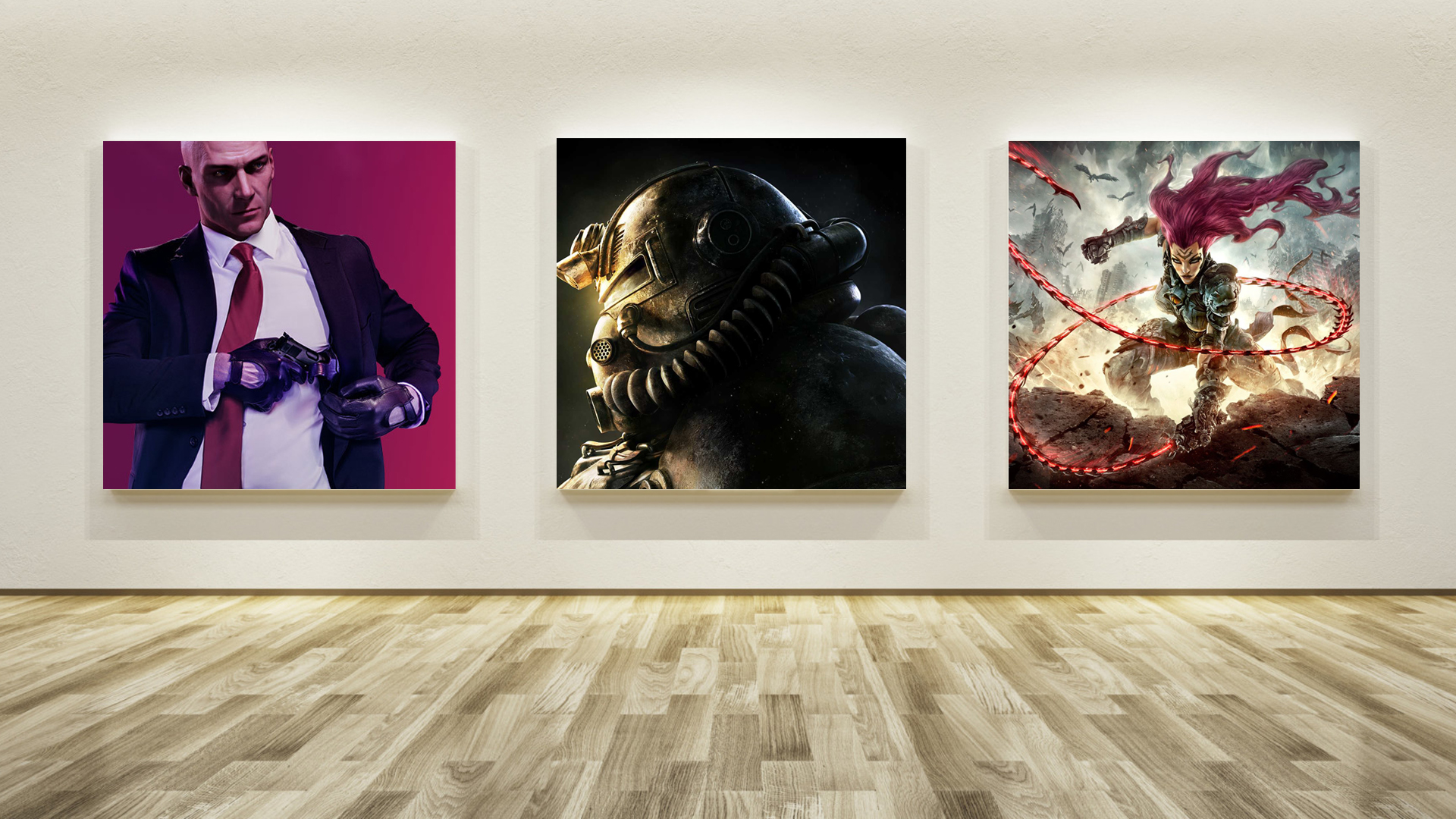
Hitman 2

One wonders, when gazing into the modish abyss of commercial graphic design, what will die first: the mind or the soul. The cut-and-paste imagery, digitised and sterile, and the colours, rarely more than a mingle of dull hues – like the made-up face of an old flame, who you hear is engaged now, clearly on the rebound and doubtless doomed not to last. It’s on this trash heap you find the twitching cadavers of discarded Call of Duty games, some poor soldier propped up, replete with pain-hardened grimace, against an airbrushed battlefield. My trips to the Tate Modern bear a striking resemblance to the scene.
A glance at the cover for Hitman 2 conveys, as quick as the crack of a rifle, the same chilling feeling of corporate malaise. A man of action as bland and hollow as Action Man, a gun, and a title card. But then, as I lingered near the shelf in CEX, two things happened. Firstly, the ‘Right Guard’ I had affixed to my underarms had perished, and the musk I was producing was strangely alluring. Secondly, the cover art made a curious impression on me. It was legendary graphic designer Milton Glaser who, when quizzed on the nature of art, responded, ‘If it moves you to attentiveness, it’s art.’ The bastard, in his banality, had me.
Was the gun being holstered or drawn? Ready to spill blood, or had its deathly duty been done? It bore the eternal ambiguity of the Mona Lisa. The gentleman’s tie was a river of red flowing from the throat. And his face, like an Avedon photograph, conveyed fathoms in its shadow. Who was this man, so ready for lethality and yet so dogged, so tired at the grim preparedness of his purpose? I have tried to capture similar moments of my local bin men, with a Kodak Instamatic, but the bastards – like those at the St. Martin’s college admissions board, all those years ago – didn’t understand, and denied me the chance. I pity them now.
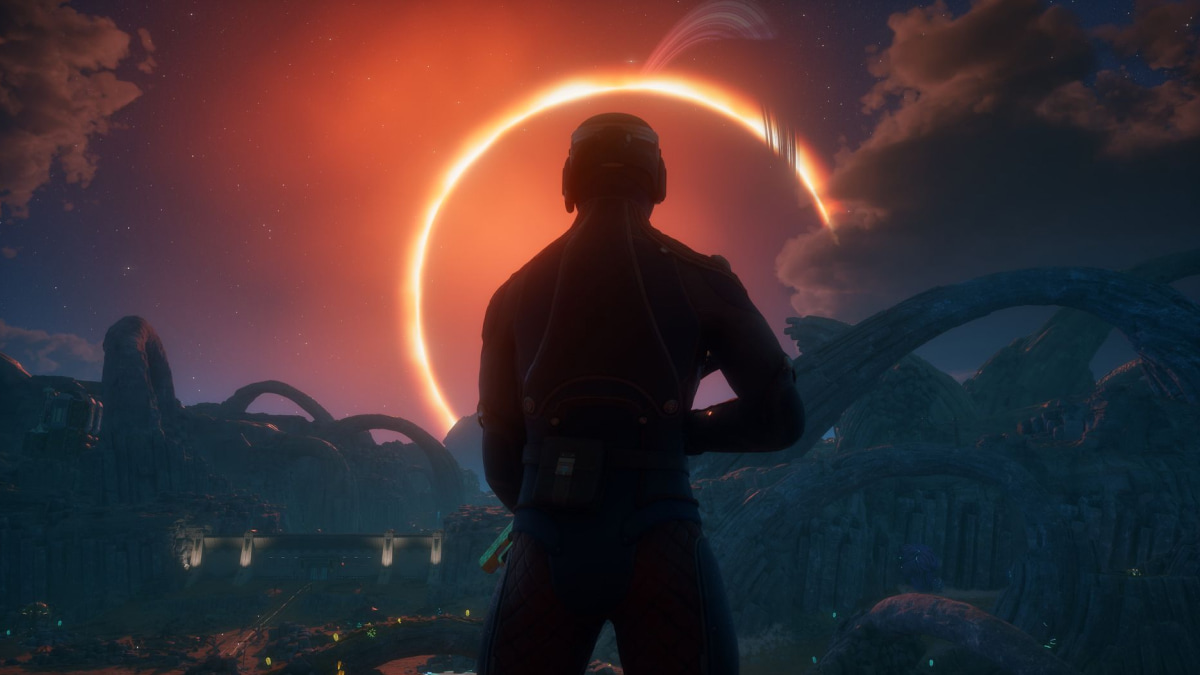
Fallout 76

While on the subject of Glaser, it was he who designed the front cover for Bob Dylan’s best album, Bob Dylan’s Greatest Hits. An image of the nasal folk hero in profile, his hair is a writhing rainbow, like a bundle of exotic snakes. Glaser’s album cover reminds me cruelly – like a ghost at the feast of a thousand squandered exhibition spaces – the lost da Vinci Medusa painting. What a brace of bitches are time and fate.
It was here that my mind swam when I first saw the front cover for Fallout 76. A clanking metal helmet, angled downwards and steady with cruelty, its breathing nozzles a vision of H.R. Giger’s Gothic nightmares. And yet, here it was, this hulking titan, turning to one side as if stamped on a coin, and all I could think of was the folk hero, the worn-shoed hitcher of Highway 61.
Perhaps it was meant to be. The iconography, as any wastrel with a weather-beaten copy of Kerouac will attest, is potent: the lone journeyman, the Americana soundtrack, the dusty highways. What is Fallout if not folk art? And what’s this? What light through yonder window breaks? The head of this mammoth thug is awash in golden light; it’s as if it looks forward to a bright future, to an escape from the gloom. I’ve felt similar yearnings – and, indeed, encased my heart in similar armour – when attempting to leave the National Gallery.
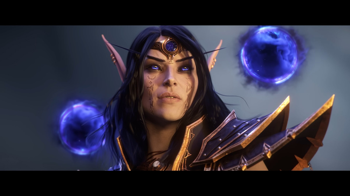
Darksiders 3

And then, at last, a trifle. It’s was quite the reversal of fortune to set my eyes on the art – though I recoil at the thought of deeming it such – for Darksiders 3. This warrior vixen, her hair a plume of plumb flame, seemed to entreat me to deep thought. It seemed a lazy attempt at invoking the majesty and fire of Dollman’s painting – in particular, The Ride of the Valkyrs. But where that work mounted its subjects on not only horses but clouds, (again the ghost of commercial design drags its filthy fingers across the canvas, as one recalls the garish advertisements for Guinness) and thus heightened their cause, this is grounded in dullness.
But it gets worse. The woman’s weapon, a glowing red whip, does more damage than any instrument of steel could hope to inflict: it patronises me. I could feel the artist behind the work insisting upon my eyes, dictating to me the sightlines I was to follow: first the outstretched hand, curving round to take in the scenery, then wrapped around the armoured shoulders of the subject, and finally lashing the distant background. I felt an affront to the butterfly wings of my sensibilities – once touched, they never settle. As such, I refused.
The last time I was told so matter-of-factly where I should be looking, and in what order, was that little thug of a curator in the Serpentine. Well friends, things didn't go so well for him. Indeed, I look forward, once my ban is lifted, to proudly reasserting my presence in Kensington. One must be aware of the inherent danger that lurks in galleries. There is, after all, a dark side to the world of art – in particular game cover art. The title of this last work was at the very least well-chosen, then.
About the Author