You can trust VideoGamer. Our team of gaming experts spend hours testing and reviewing the latest games, to ensure you're reading the most comprehensive guide possible. Rest assured, all imagery and advice is unique and original. Check out how we test and review games here
Each Month, we invite élite art critic Braithwaite Merriweather to appraise the box art of the latest game releases. In between his time spent wandering the corridors of culture, Merriweather writes on a freelance basis for various publications, including Snitters and Nuneaton à la Carte. If you are unaware of his prowess, rest assured; he’s on a crusade to educate the unwashed. Put simply, he’s a man that needs no introduction.
Friends! We all do what we do in a moment in time, and it is to my eternal shame that (to paraphrase, and, honestly, improve upon David Copperfield) I am born too late. The Belle Époque of game box art is gone – swirling down the plughole like so much cheap champagne. I must endure the snide dinner party banter of my elder forebears, who gorged their appetites in the Amiga era and shut the door behind them.
Time was that players needed the art to stoke the furnaces of their imaginations, that they might better breathe life into those stark, sultry pixels dancing in the void before them. With the graphics of today, there’s no need to imagine! And so the art suffers. But not always. A critic’s work is never done. I mustn’t lose hope, for there are always diamonds yet to uncover in the dustheap! On to the month’s releases with zeal!
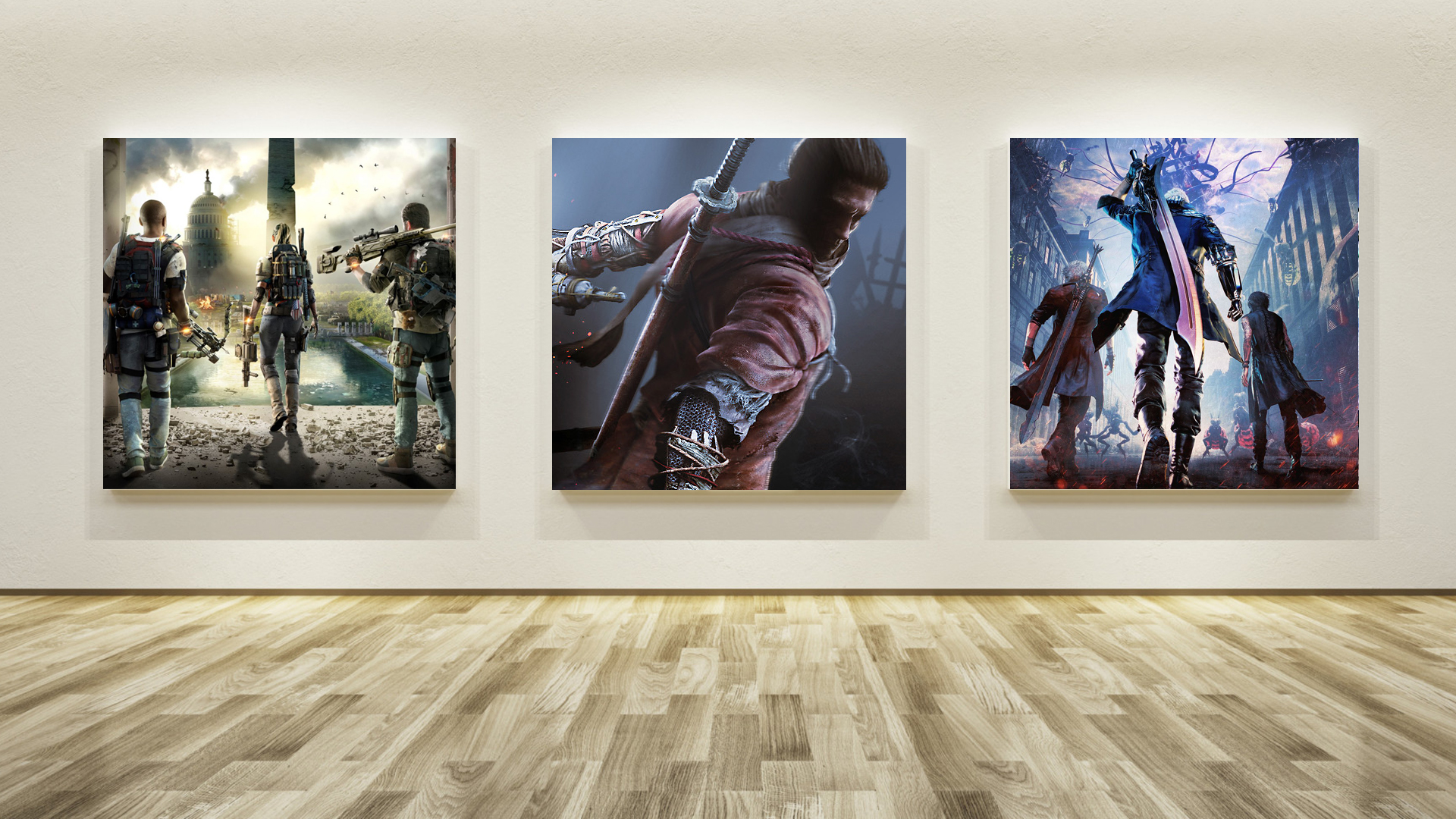
The Division 2

It seems the universe has other ideas for my determined enthusiasm, and is keen to bury it under a nuclear payload of mediocrity. Seeking fresh inspiration, the team behind The Division 2 looked as far as the front cover for The Division, on which three men stood facing away from the camera in a derelict city. It dazzled us with all the varied colours of concrete. Now with The Division 2 we get two men and a woman with their backs to us, in front of a great erect instrument of power – the Washington Monument – and the palette has been swapped to sunny smog. Joy.
What I want to know is, what’s so offensive about us, that these people should turn away? It reminds me of me, turning my back on the festival organisers of the Berlinale last month. It seems the world of film has yet to address the glaring blind spot in its critical milieu: why have none of the greats (the Kaels, the Brodys, the Whites) nor any of the fools (the Siskels, the Eberts) denied critique of film front covers? Pathetic. Friends, you should have seen me walking away from those morons, head held high, toward the nearest German branch of CEX. (It turns out the Teutons don’t have it, but I found an equivalent, and thus the anecdote stands.)
Sekiro: Shadows Die Twice
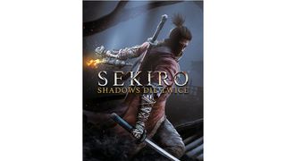
If you’re going to set a game in a fantastical feudal Japan, then one hopes you would lean into the lineage somewhat. Alas, this is not the case with Sekiro: Shadows Die Twice. Where I would quiver with excitement at the thought of a Katsushika Hokusai-inspired cover – a great conflagration of crashing blue like that which you find in The Great Wave off Kanagawa. No. Instead, what we have on the front cover of this work is a gentleman who can’t seem to decide whether he wants to obey the boring rule of box art – that one must turn one’s back to the viewer, in pensive defiance – or defy it.
His head’s turned toward us, his body greeting us side-on, and his left arm facing away. It brings to mind the life drawing class I was forced to attend as part of my community service, back in the late ‘80s. The class, which was primarily composed of elderly hobbyists, didn’t seem to appreciate the way I played with the traditional form – twisting and undulating before them in a series of movements that could only be described as ‘life’ in all its rapturous ecstacy. Nevertheless, Sekiro doesn’t commit itself to any discipline, and so it’s dead to me.
Devil May Cry 5

Oh for God’s sake. Right, I’ve contacted the editor of this illustrious site and refuse – on grounds of principal, and personal well-being – to critique this. There comes a time when one must declare enough is enough, and the meagre offering of box art this month has all but entirely toppled my good cheer. If you must, go back and up and read my entry for The Division 2, but replace ‘Washington Monument’ with ‘large tree’; swap out ‘sunny’ for ‘pink’; and change ‘two men and a woman’ for ‘three men and a robotic arm.’ Better yet, swap ‘Devil’ for ‘I.’
About the Author