You can trust VideoGamer. Our team of gaming experts spend hours testing and reviewing the latest games, to ensure you're reading the most comprehensive guide possible. Rest assured, all imagery and advice is unique and original. Check out how we test and review games here
Ubisoft has changed its logo for the first time since 2003. Here’s the old one:
/https://oimg.videogamer.com/images/cb40/3c971832-b60c-49da-af5f-feb34bf042ac_Ubisoft_Logo_II_(2003)_(Black).png)
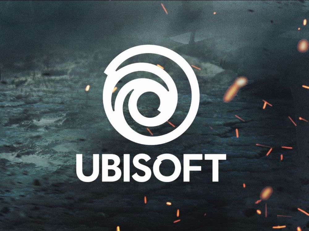
And here’s the new one. As you can see they are extremely different.
/https://oimg.videogamer.com/images/727a/47bf8d8c-315e-4cef-8bd8-1814e6b968c8_Ubisoft-2017.jpg)
Quite frankly, though, these both pale in comparison to the original Ubi logo from 1986, which we found by looking up Ubisoft on Logopedia (which is a thing, by the way?).
/https://oimg.videogamer.com/images/0a02/e06c5c01-291c-4d62-ab5e-58f3ac7254f9_1986_Ubi_Soft.jpg)
It is our considered opinion that Ubisoft should take a leaf out of Call of Duty’s book and go back to its roots. It’s pink and blue, 80s neon roots.
