You can trust VideoGamer. Our team of gaming experts spend hours testing and reviewing the latest games, to ensure you're reading the most comprehensive guide possible. Rest assured, all imagery and advice is unique and original. Check out how we test and review games here
Each month, we invite élite art critic Braithwaite Merriweather to appraise the box art of the latest game releases. In between his time spent wandering the corridors of culture, Merriweather writes on a freelance basis for various publications, including Snitters and Nuneaton à la Carte. If you are unaware of his prowess, rest assured; he’s on a crusade to educate the unwashed. Put simply, he’s a man that needs no introduction.
I can see the thugs now. Crammed together, begreased by the late-April heat, in the garden of the public house opposite my flat. Fools! Having telephoned said public house and offered to set up a constellation of miniature galleries amidst the tables, the better to inspire the beer-dimmed brains of the general public, as they rouse from the restless hibernation of lockdown. Unfortunately, the landlord, evidently no patron of the arts, refused my offer, citing a lack of space. I shouldn’t vex myself over the matter, of course; the neanderthal publican and his libation-drubbed clientele were unlikely to have benefitted much from even my work. After all, there can be no vaccine for an inherent lack of taste. In the shade of my study, I am sitting at the desk, the slatted shadows of the venetians slicing across the oak, and I am confronted by this month’s crop. To the work!
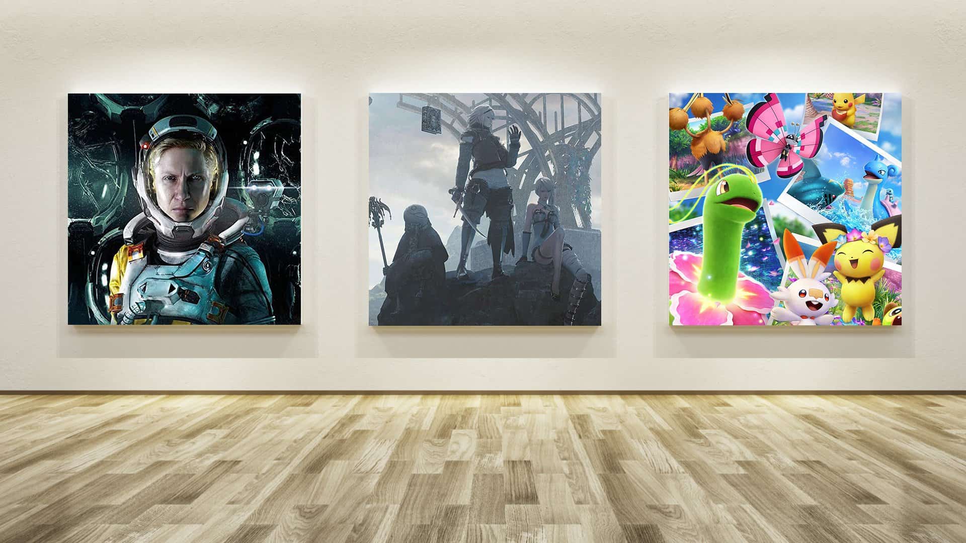
NieR Replicant ver.1.22474487139…

Some works make one feel as if one is not gazing at a work at all but, rather, gazing out the window—such is the richness with which they are infused with real life, drifting in like a draught. In the case of this new work, entitled “NieR Replicant ver.1.22474487139…,” I feel this sensation quite literally. Just recently, I filed an objection to my local council’s ghastly proposal for an elevated motorway, and indeed a further objection to the “artist’s representation” of the finished project—it goes without saying that the billboard in question is neither artistic nor a representation of anything beyond the planning department’s dirty little cash-addled fantasies. If I wanted to look, for any length of time, at a desolate and bluish landscape, blighted by an eyesore of metal bones, then I need merely glance out the window in the direction of the proposed building site.
In any event, this is not to say that “NieR Replicant ver.1.22474487139…” is entirely without merit. The artist behind this work clearly smitten with the work of James McNeill Whistler; in particular, with “Nocturne: Blue and Gold—Old Battersea Bridge” (c. 1872–75). Note, in both cases, not only the showy elastication of the title but the sky—one hanging over London; the other, Lord knows—which is mostly grey, but scratched through with light, threatening either the hope of morning or the end of an evening’s pleasures. The critic John Ruskin, having viewed an exhibition of Whistler’s work, accused him of “asking two hundred guineas for flinging a pot of paint in the public’s face.” Whistler sued for libel. As such, for fear of similar litigious retaliation, I will not accuse the artist behind this new work of flinging at our face anything other than the earnest desire to impress. Still, if the title is to be believed, it took them rather a lot of flings, and it still bears a trace of the unfinished. I can’t help but Baron Huddleston, who, presiding as judge over the libel case, asked the court, “Which part of the picture is the bridge?”
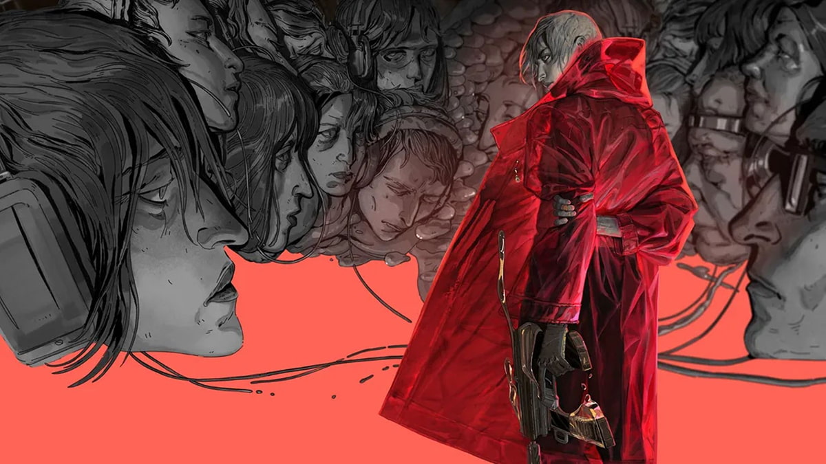
Returnal

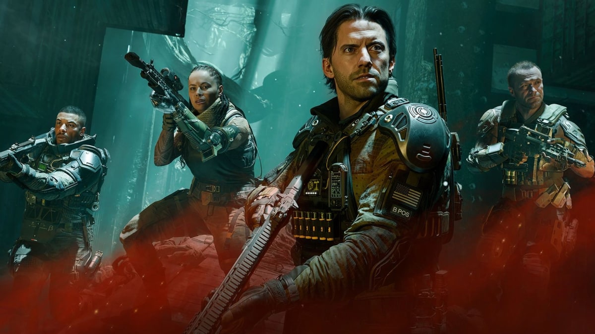
Ah yes, pain, boredom, and misery. The divorce proceedings into which I was mired, like a car on a muddy slope, gave me a sufficient taste of unending torment—not for the sundering of happy relations (Christ, no) but for the bureaucratic and judicial tedium of the process, which saw me eternally returning to the local courthouse, wearing an expression not unlike the figure of this new work. “Returnal,” as it is called, pays a clear homage to Francis Bacon’s “Study for a Head” (1952), with its oil-smeared gloom and its garish streak of yellow, like the dashed lines and dark tarmac of an American road. The artist behind “Returnal” has more in mind than an embrace of the past; note the sea of cracked helmets, upon which the central figure is marooned. And what are we to make of her? The gun in her hand, the grim set of the mouth, the frown that dominates her face: if this is a study for a head, what do we learn? Sadly, she gives us little, and the artist hardly seems interested in illuminating her pain, which, for all we know, could be something as great as a council proposal for a nearby elevated motorway or, who knows, the looping lethargy of a divorce.
New Pokémon Snap

Just because something arrives laminated in sticky, lollipop hues doesn’t mean that it comes bearing any brightness or sweetness of spirit. Indeed, the longer I look at this work, “New Pokémon Snap,” the more I am convinced that it may be the most dreary of this month’s crop. Look at this queasy melange of creatures that pullulate all over the frame. I am reminded of Benjamin Waterhouse Hawkins, the Victorian dinosaur nut who erected the scaly statues of Crystal Palace Park, and who painted “Jurassic Life of Europe” (1877), which depicted a similar scene as the one in the new work—albeit one earthed in more fossil-friendly tones. In both works, we have a small patch of turf lounged on by lizard-brained beasts grazing on God knows what and frolicking in the face of near extinction. Indeed, as I lift my eyes to the pub garden across the road, I feel the sensation of real life wafting in again.
About the Author

